Theme
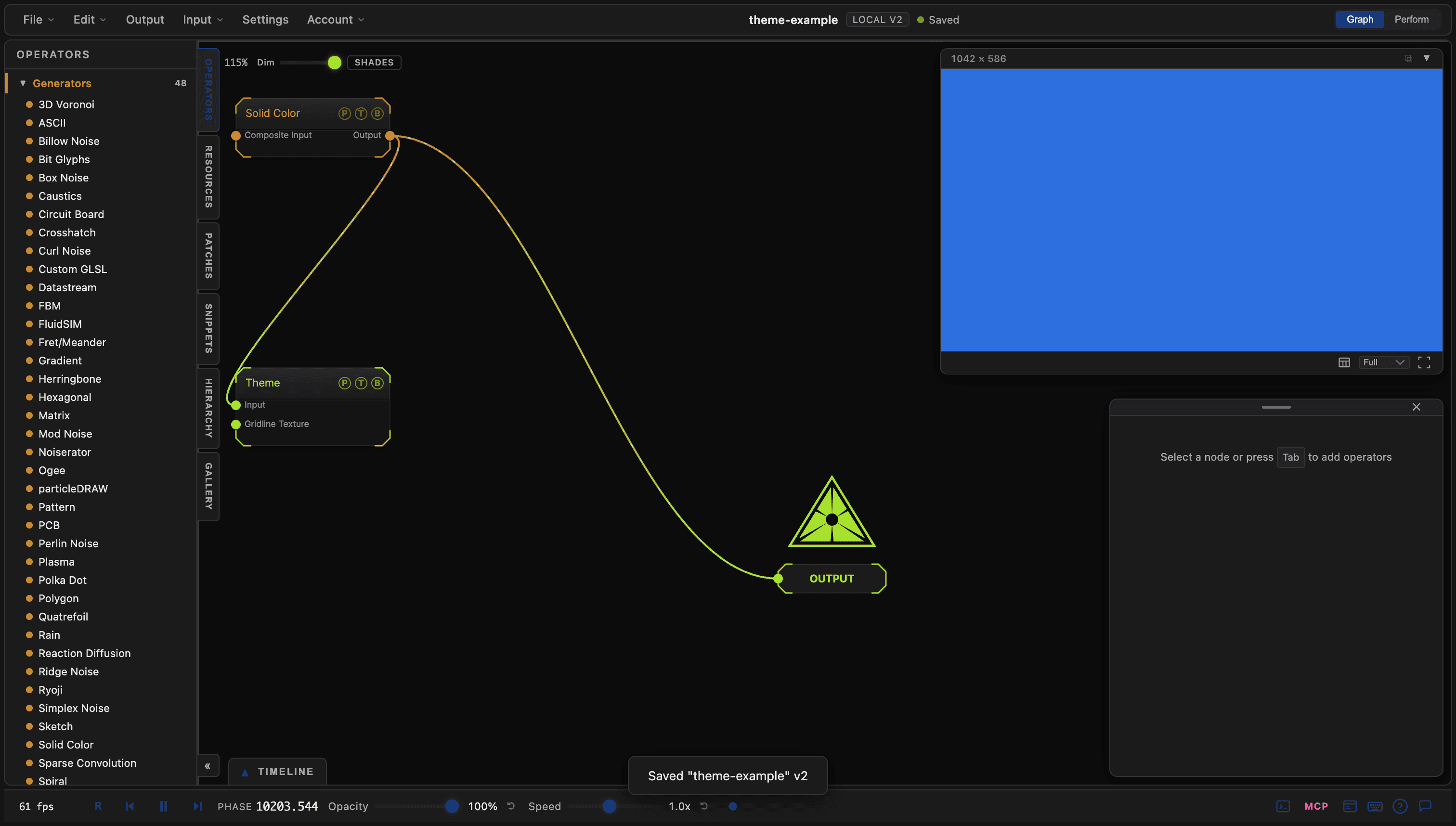
Samples a wired texture at each UI region's screen position and applies the colours to the application chrome, with grid controls for the node graph.
The Theme node recolours the app from a texture. Wire any image into it and the panels, text, and graph background take their colours from the pixels under them.
- Mode Accents or Full Takeover, with Amount and an Update Rate
- The node graph grid lives here: Grid Lines Type, thickness, axis, and colours
- Found in the node graph under I/O → I/O
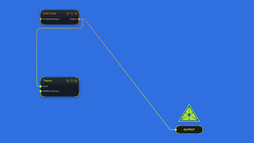
The image on the right is the example patch itself. Drag and drop it onto the app, or load it with File → Load, to open the full graph. A blue Solid Color drives a Full Takeover of the chrome.
Inputs and outputs
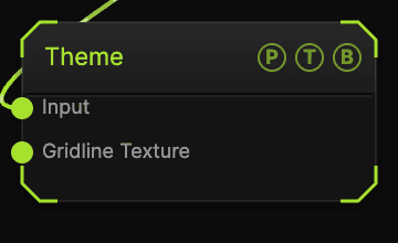
| Port | Type | Purpose |
|---|---|---|
| Input | Texture | The texture sampled for the chrome. |
| Gridline Texture | Texture | A texture inked into the graph grid lines. |
Parameters
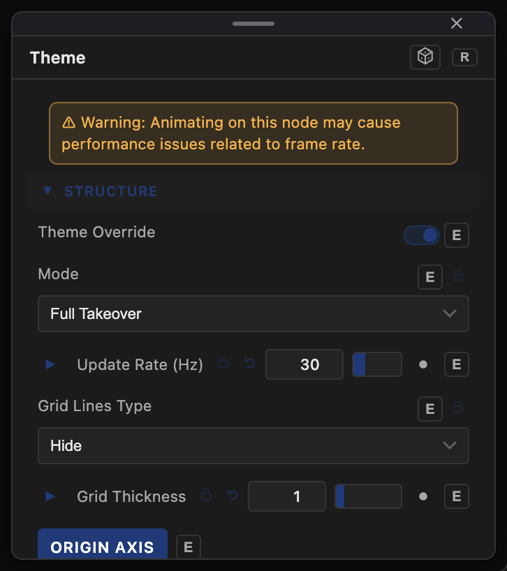
- Theme Override (default on) — the master toggle.
- Amount (default 1), Mode (Accents default or Full Takeover), Update Rate (Hz) (default 30).
- Palette Color, Text Color, Graph Background — the base colours the texture modulates.
- Grid Lines Type (Hide default, Dots, Gridlines, Crosses, Dashes, Long Dash), Grid Thickness, Origin Axis (default on), Graph Gridlines, Anchor Texture to Graph, Graph Axis X / Y colours.
- Slider Opacity (%) (default 100), Normalize Ramp, Ramp Period (rows).
The node warns that animating its inputs can cost frame rate; keep Update Rate (Hz) low when the source moves.
Every slider has a per-parameter animation bar, so it can be animated, audio driven, or MIDI mapped.
Examples
Patch-coloured UI — wire the Output node's own source into Theme with Mode Accents.
Troubleshooting
The grid vanished — the grid defaults to Hide and is controlled here, not in Settings. Pick a Grid Lines Type.